J. Dawgs
How can a cult-favorite restaurant grow without losing that special something that made people fall in love in the first place?
Brand · Environment · Strategy
One day a broke student walked by a run-down 12’x12’ shack and thought, “That’d be a great spot for a hotdog stand.” A decade and four restaurants later, J. Dawgs’ founder Jayson Edwards was ready to get back to the roots of that original red shack.
Before designing J. Dawg’s first downtown Salt Lake City restaurant, we needed to help them rediscover their own magic. Together we pinpointed what made it great at the beginning: the great dawgs and good times. Bonafide, convivial, and just plain fun, the refreshed J. Dawgs brand is as familiar as it is unique.
Dusting off a good story
Brand strategy
Every brand has a story‒and J. Dawgs has an especially powerful one. Imbued with the personality of its founder, J. Dawgs is equal parts scrappy underdog, lovable rebel, and trustworthy everyman. But these things were getting lost in translation in their new restaurant spaces, and core messages had been watered down.
After a few workshops,we aligned on joy as the reason J. Dawgs exists. The restaurants should create joy by serving real ingredients, providing awesome service, and creating a vibe as casual and fun as a ballpark in the summertime. That right there is the secret sauce.

All about the dawg
Brand identity
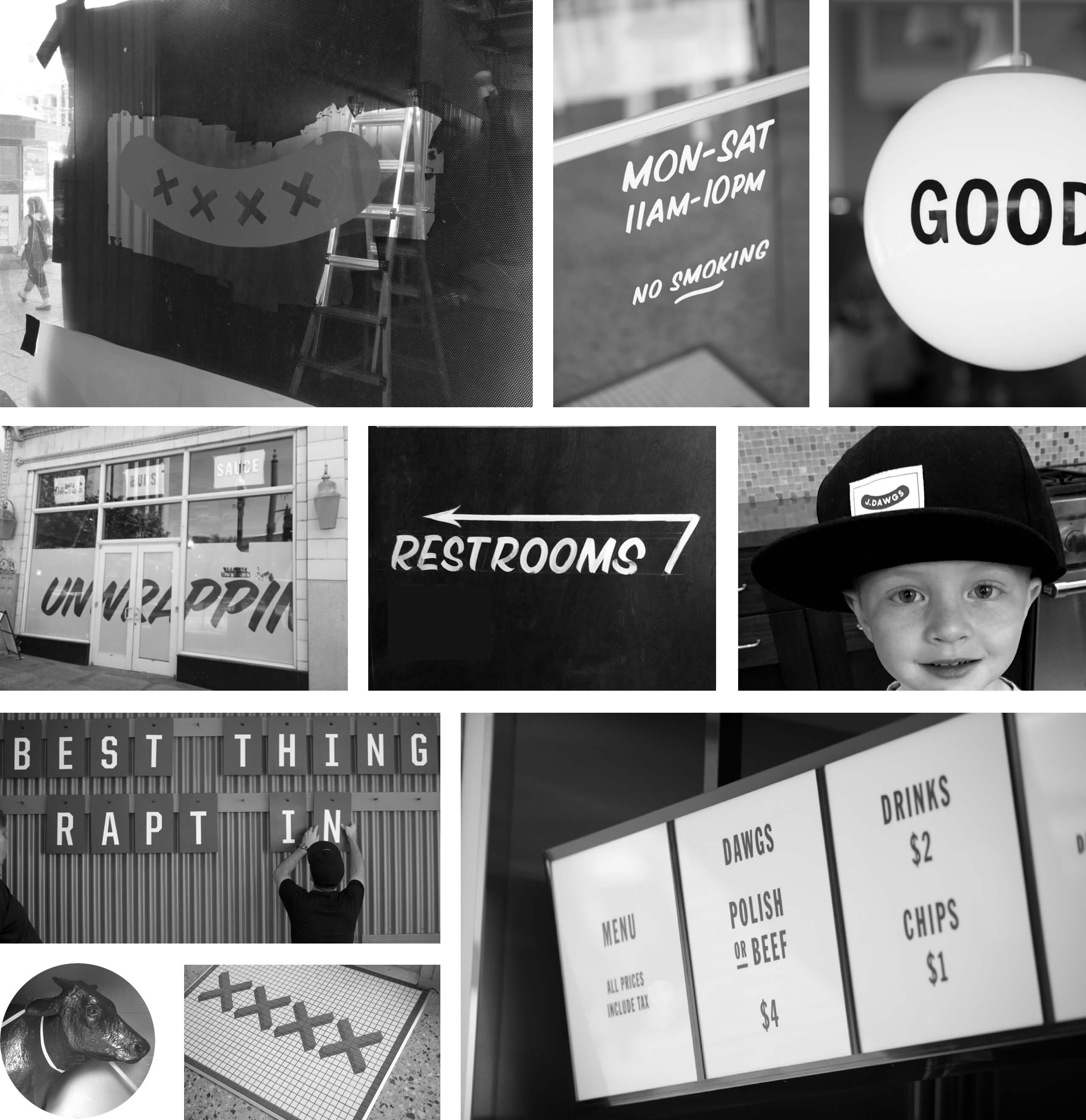
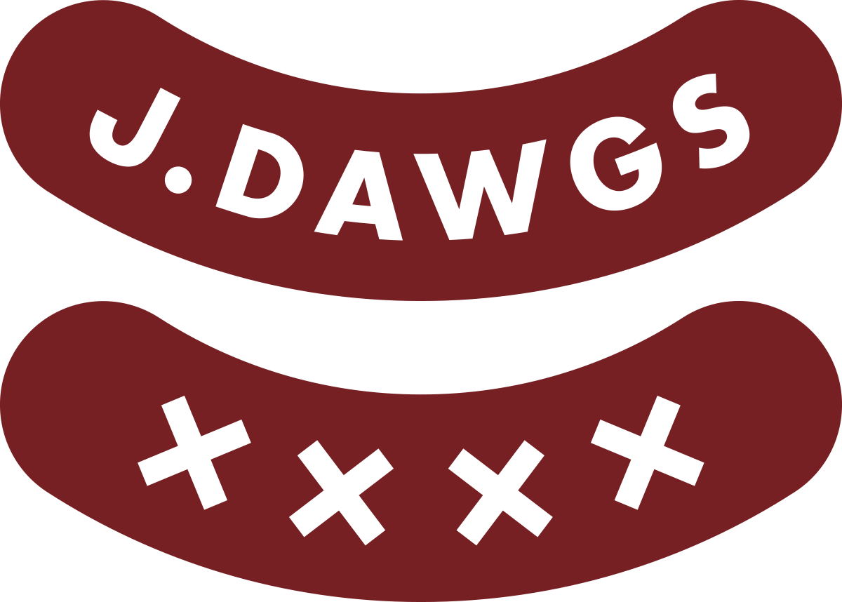
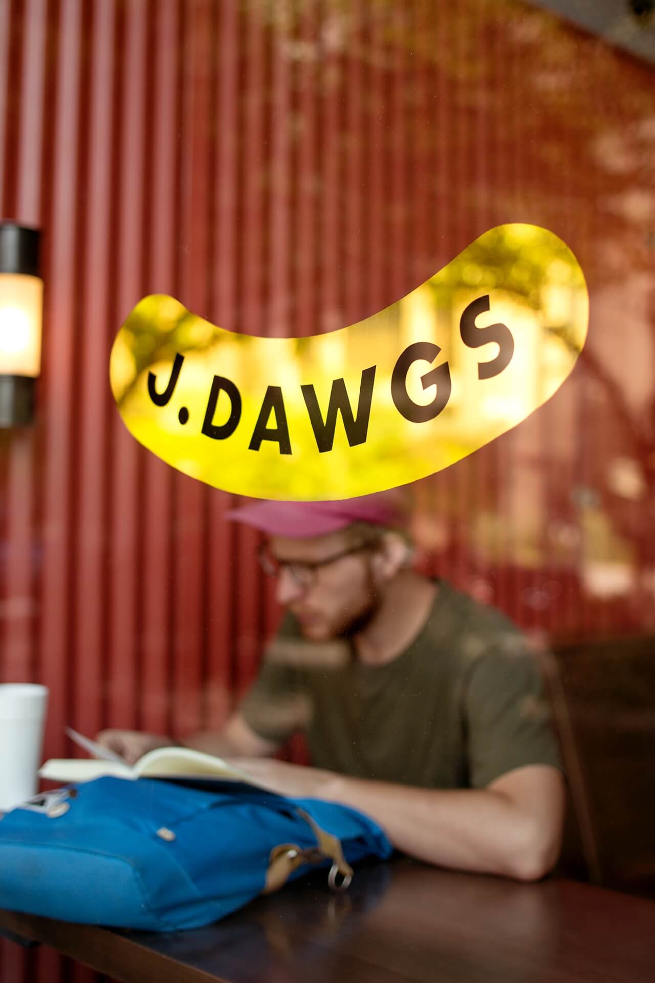
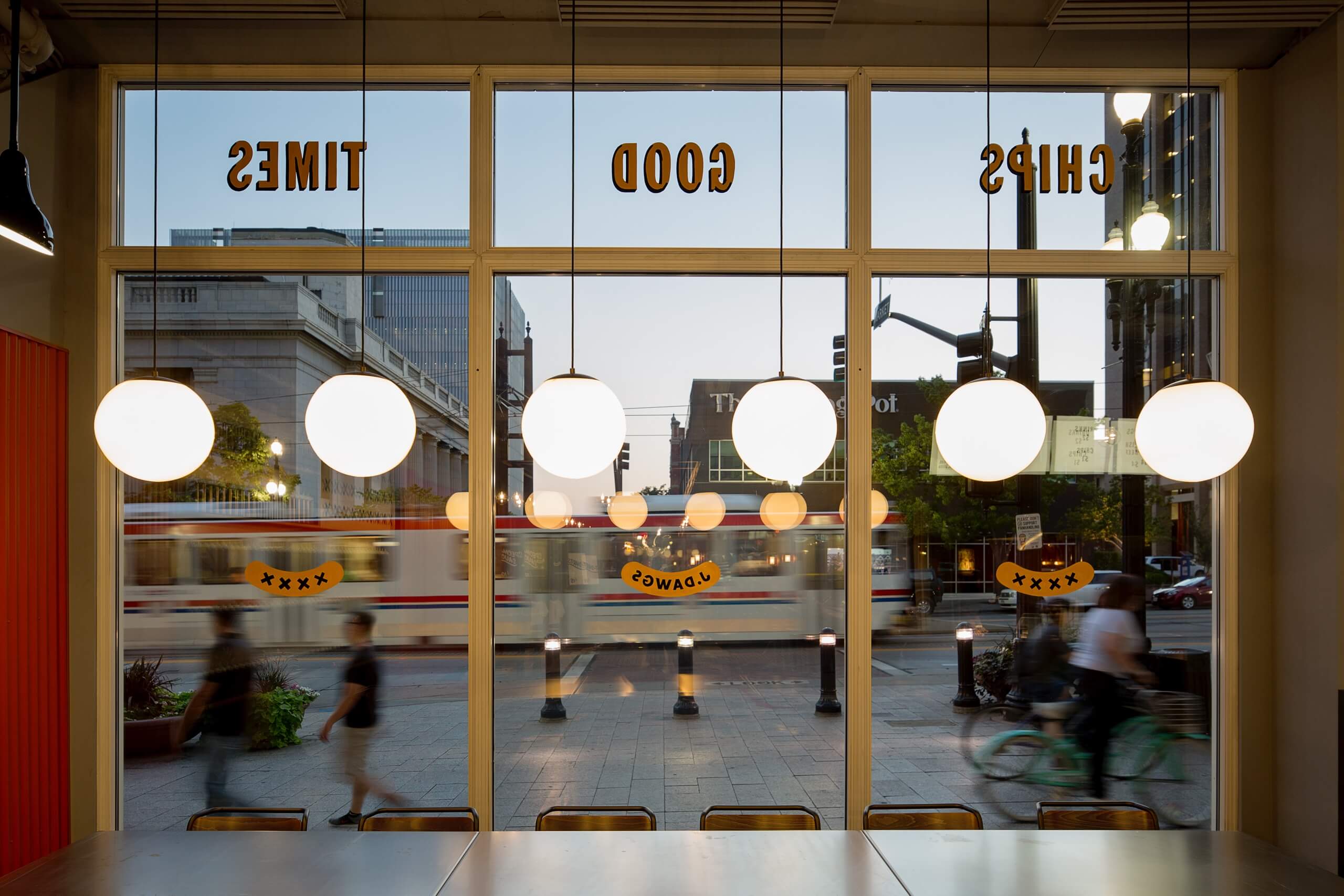
When we got to it, J. Dawgs logo was exactly what you’d expect of a fast casual chain. And there lay the rub. To create a more iconic mark, we made the hot dog king and added a bold, custom typeface. The secondary mark riffs on the patented x’s scored onto each dawg, turning an aesthetic trademark into a J. Dawgs signature.


Feast for the senses
A kitchen-centered restaurant
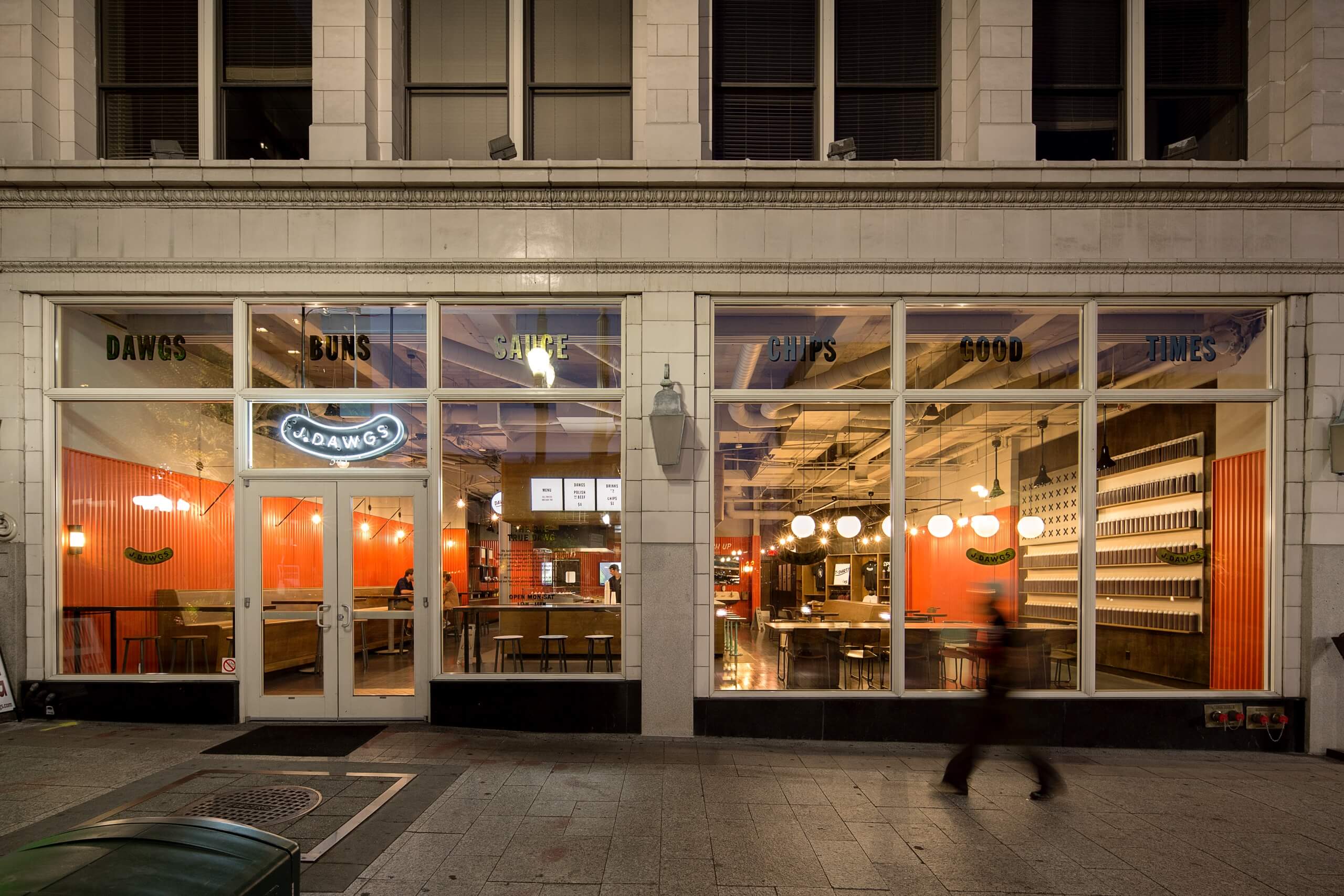
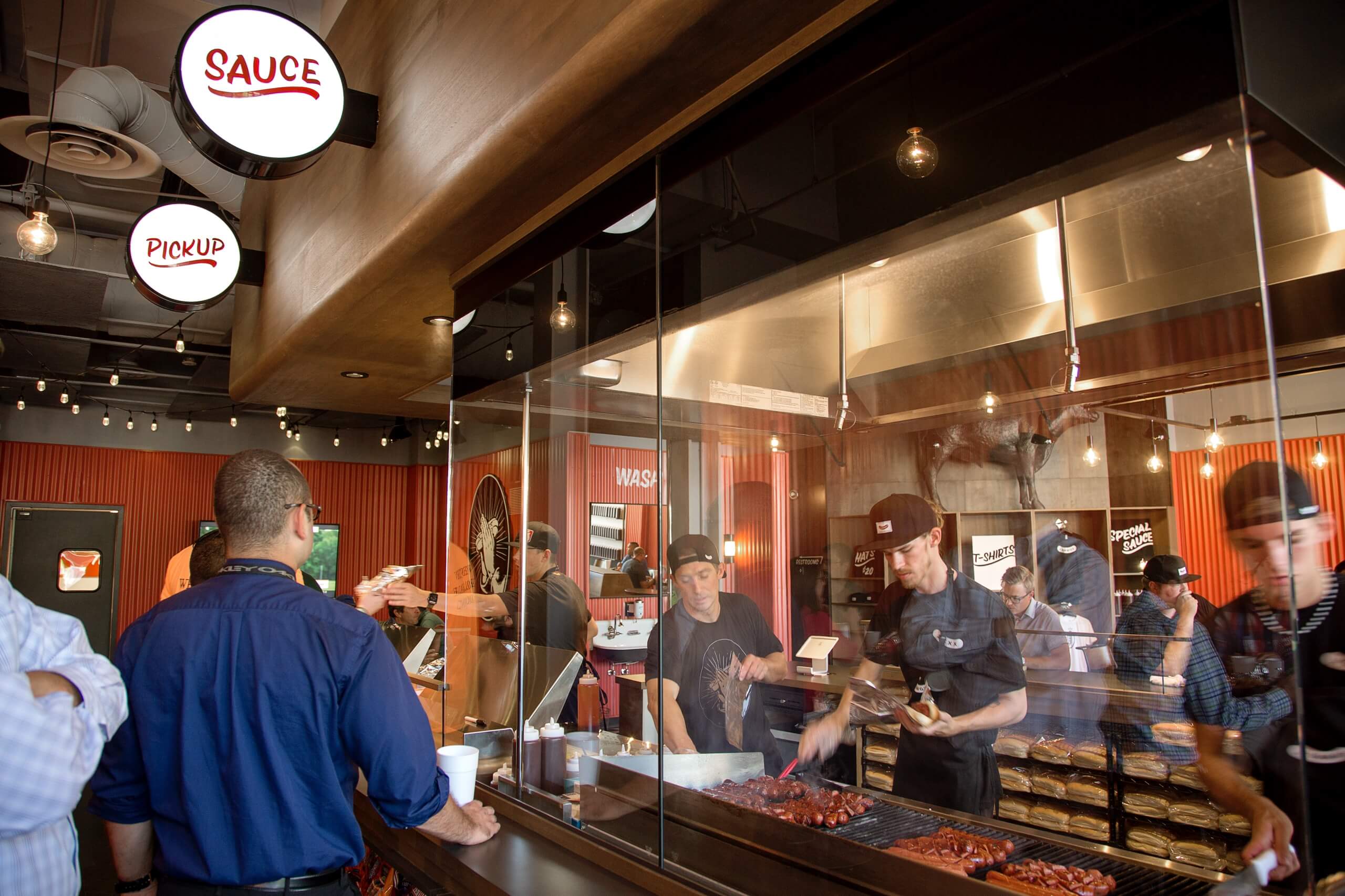
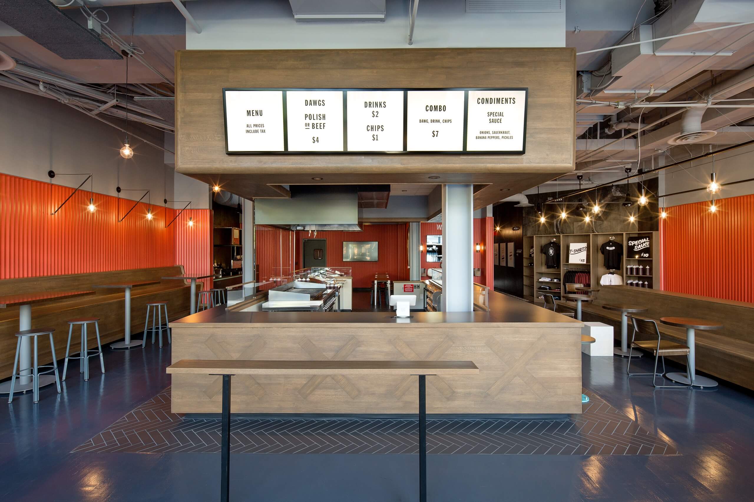
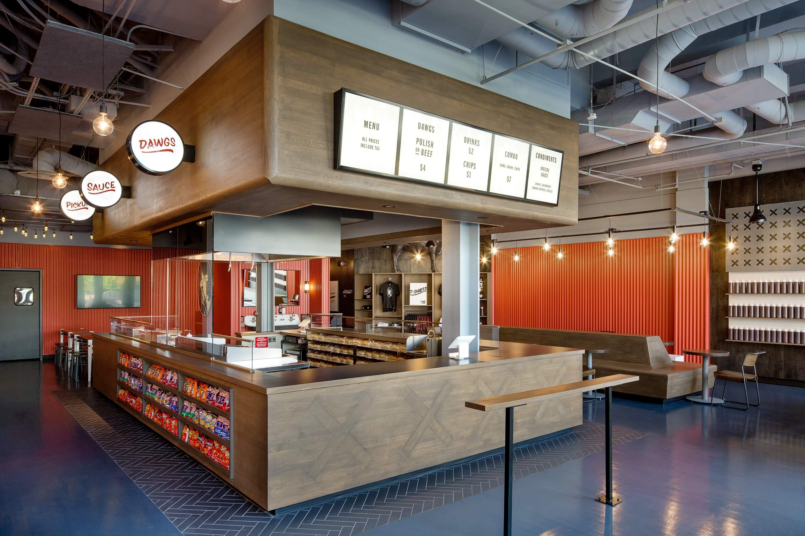
With the kitchen at its center, you can see the faces of the grill masters, hear and the beef sizzle, and see and smell the dawgs in all their glory. Sidle up to the dawg bar to skip the line, or take a seat at the old railway station-style banquette. Red corrugated steel gives a material nod to the original red shack, and painted plank floors add to the throwback feel.
Fresh threads
Grill Uniforms
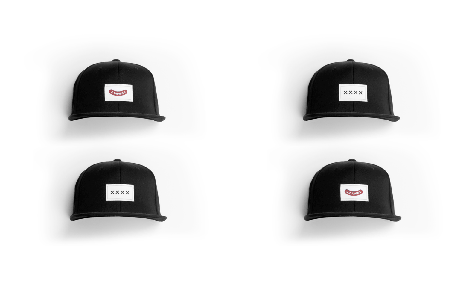
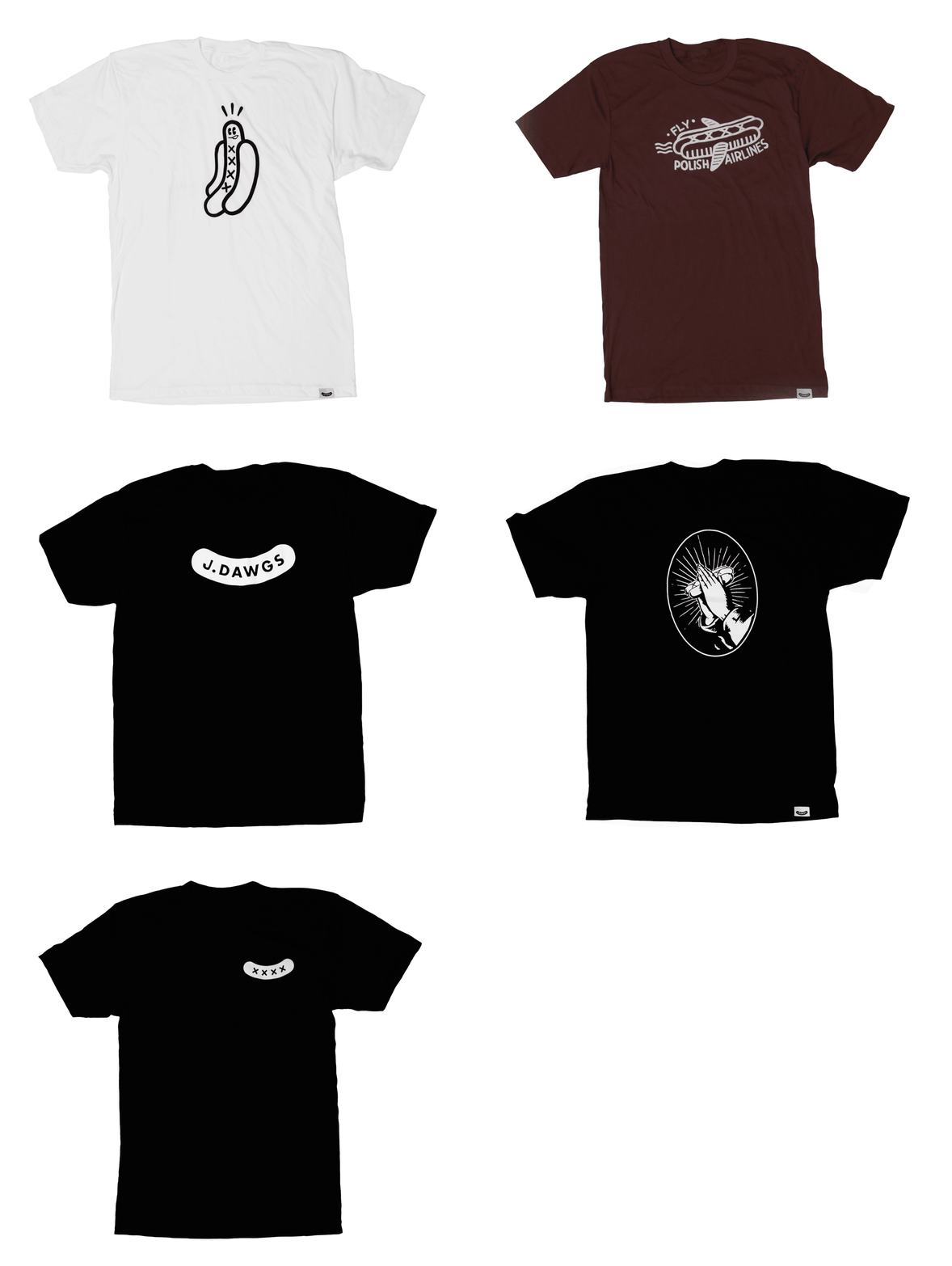
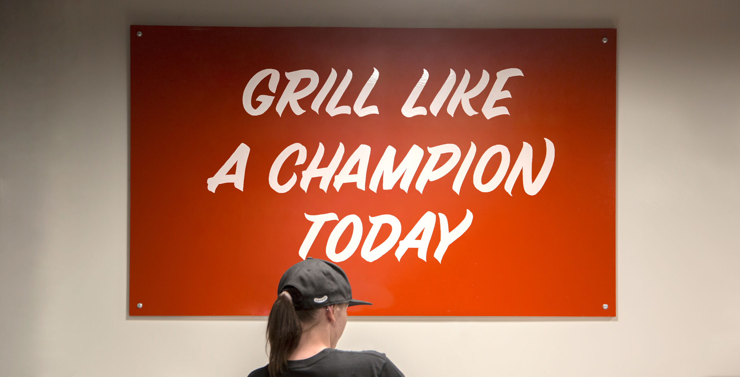
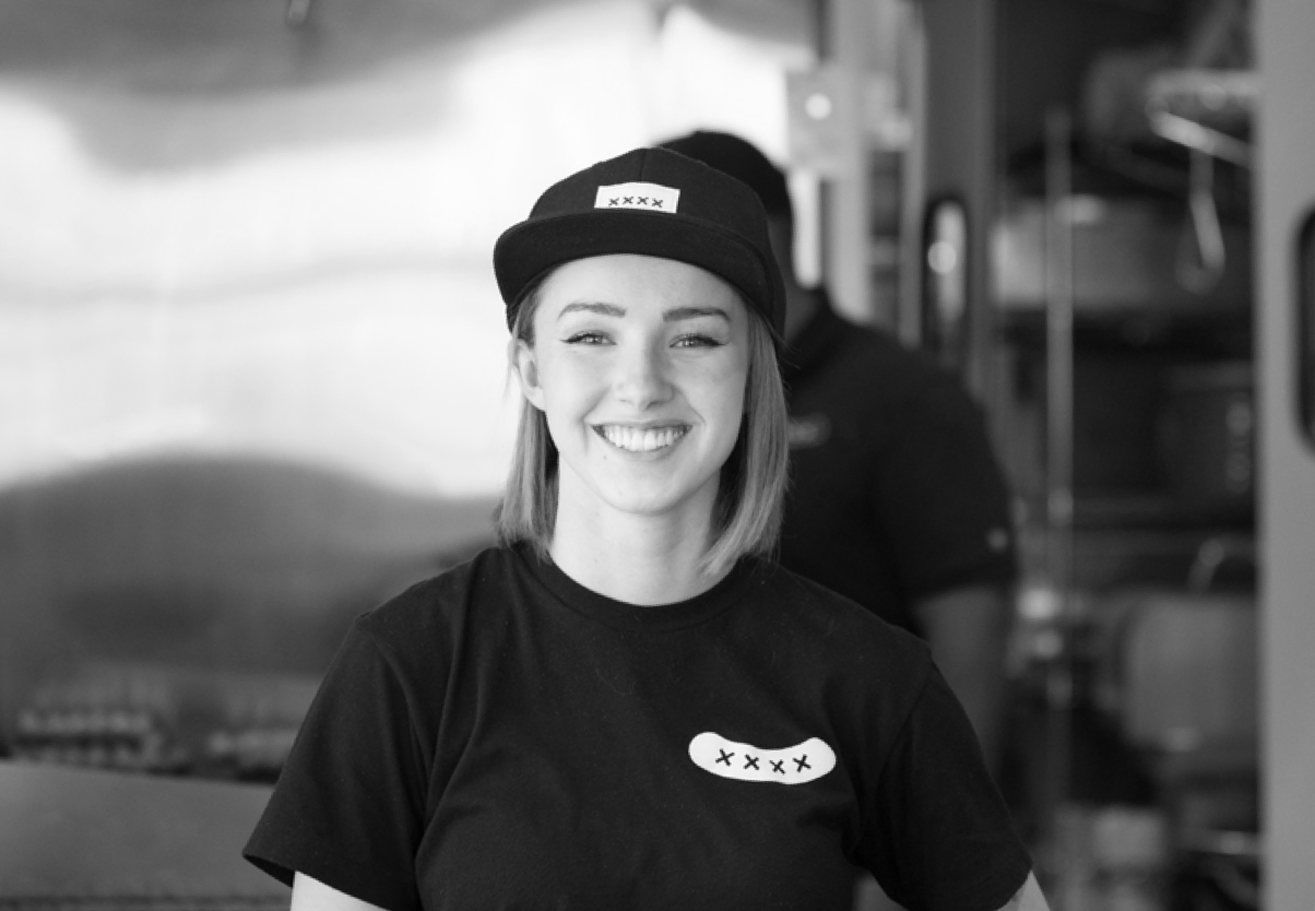
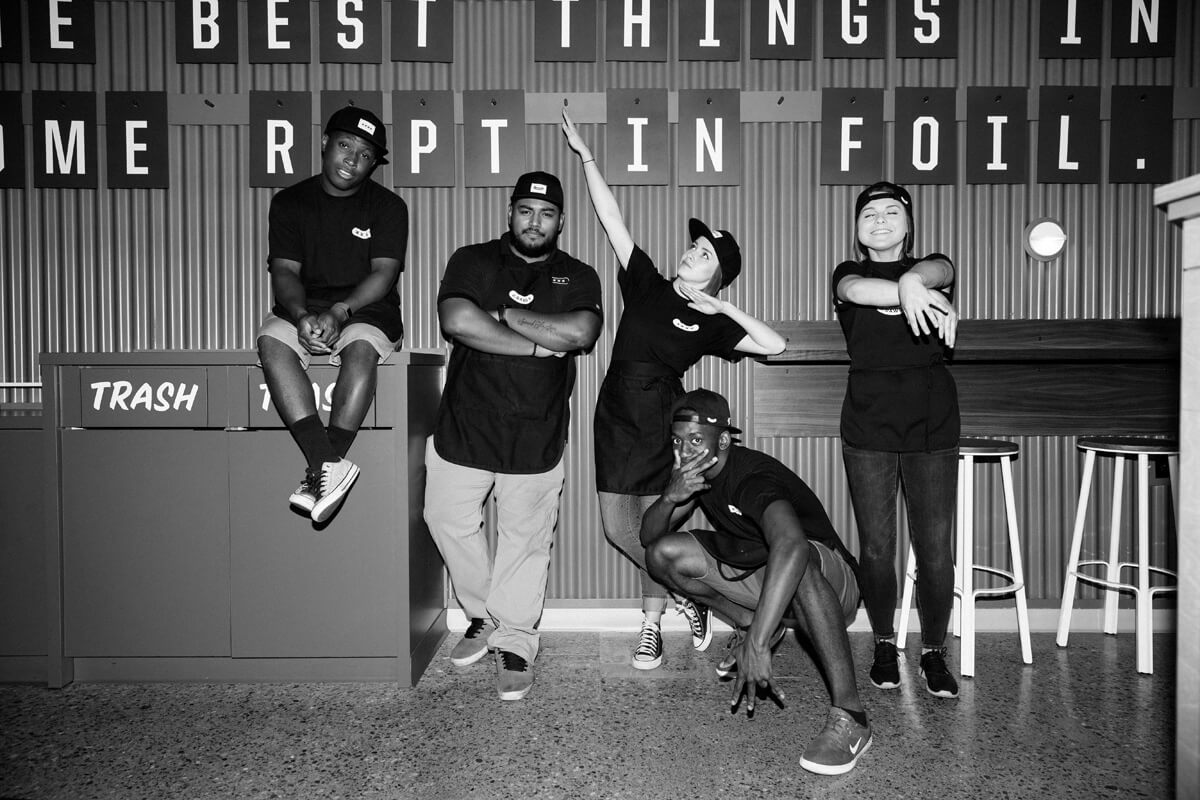
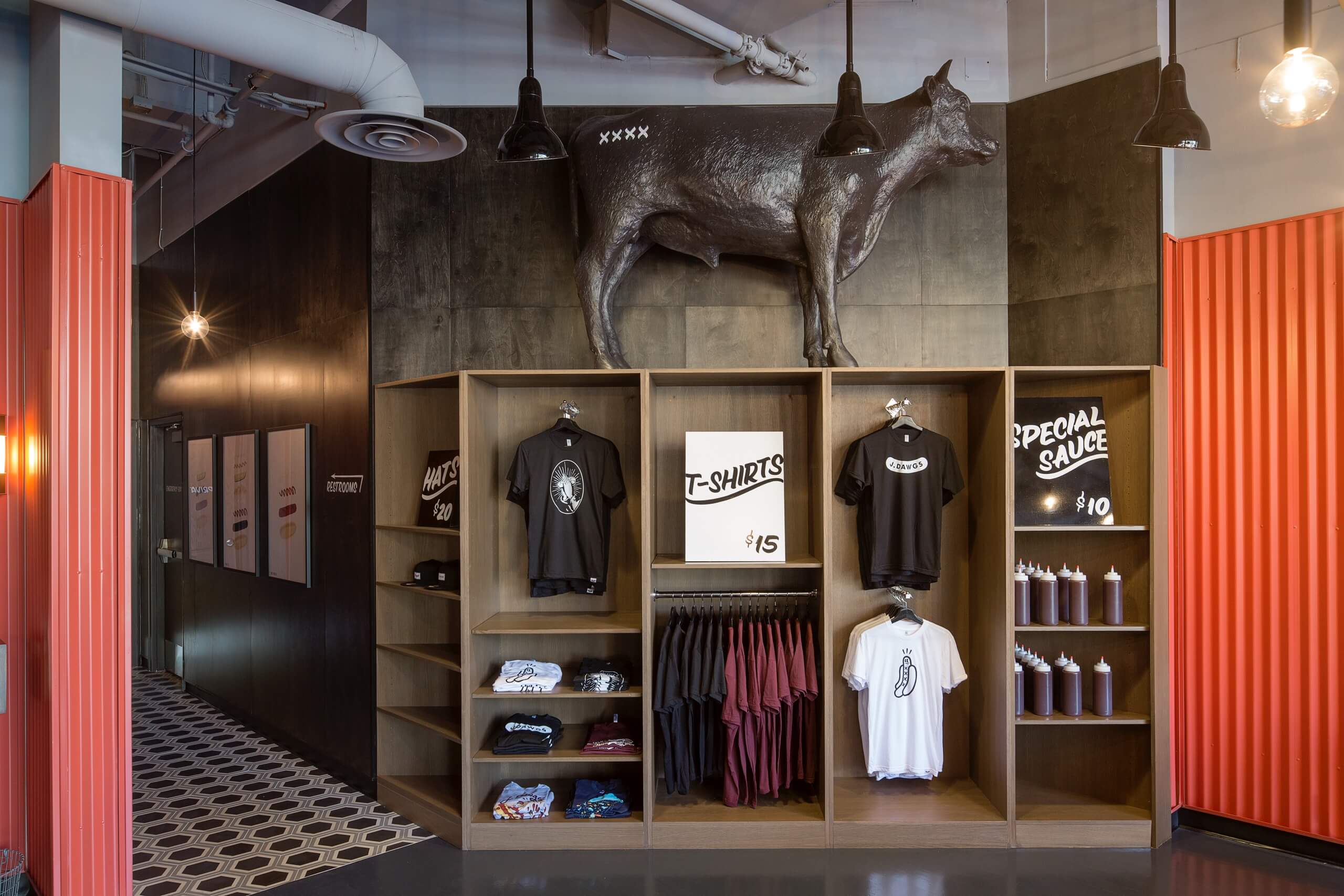
Part of creating a fun, relaxed restaurant is making sure employees feel good. Grill-grade aprons, flat brim baseball caps, and a set of simple black t-shirts are part of a system that encourage employees mix-and-match, and customers to rep J. Dawgs out on the street.
Wash up
Basin sink
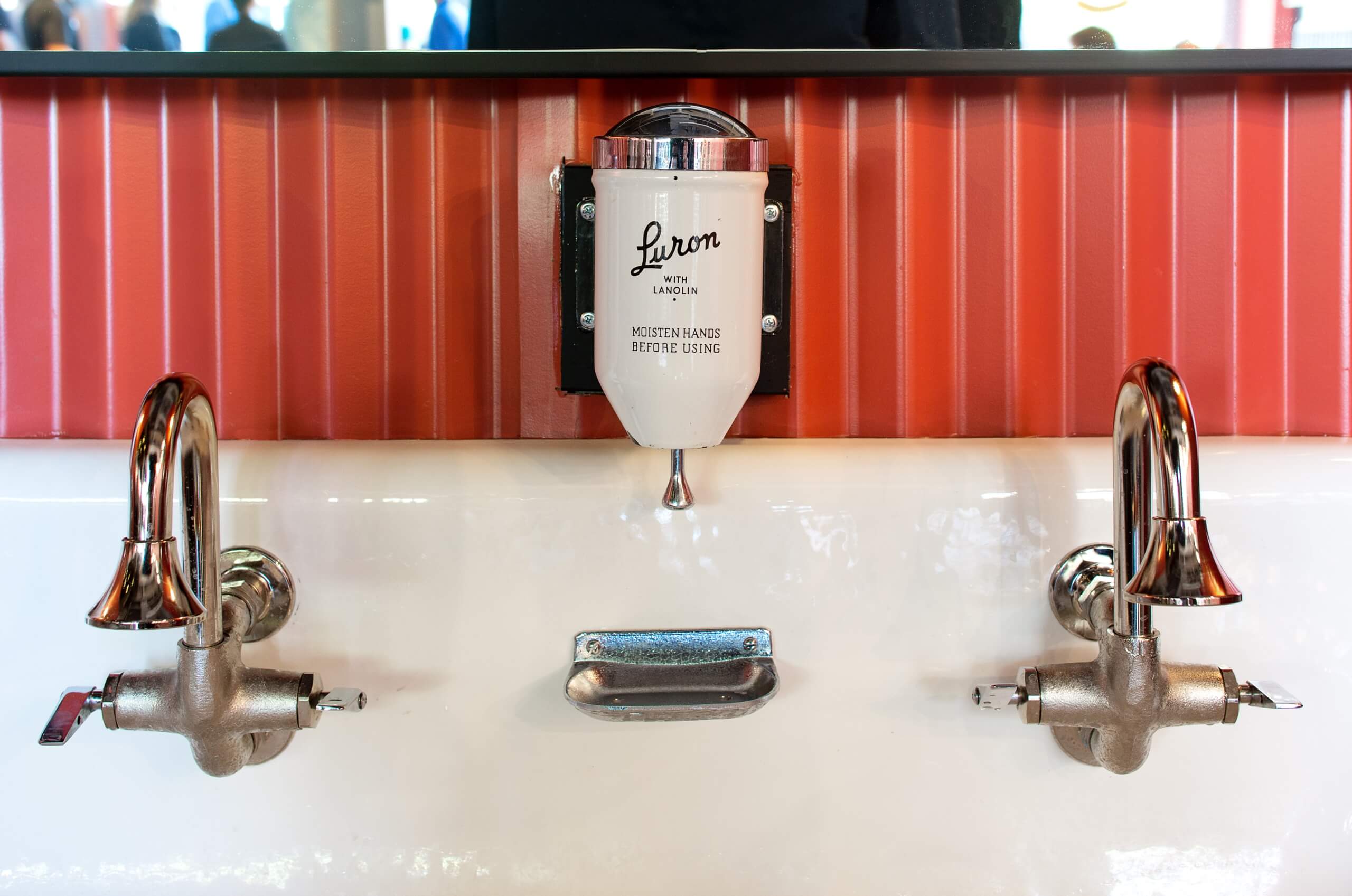
At first glance, the trough sink at the back of the restaurant is just a great way to get the sauce off your hands. But it also evokes familiar memories like washing up around dinnertime. For adults, the powdered soap may be a nostalgic reminder of their time in elementary school. For kids, it’s a memorable novelty and another deliciously tactile experience.
Americana with a twist
Playful moments
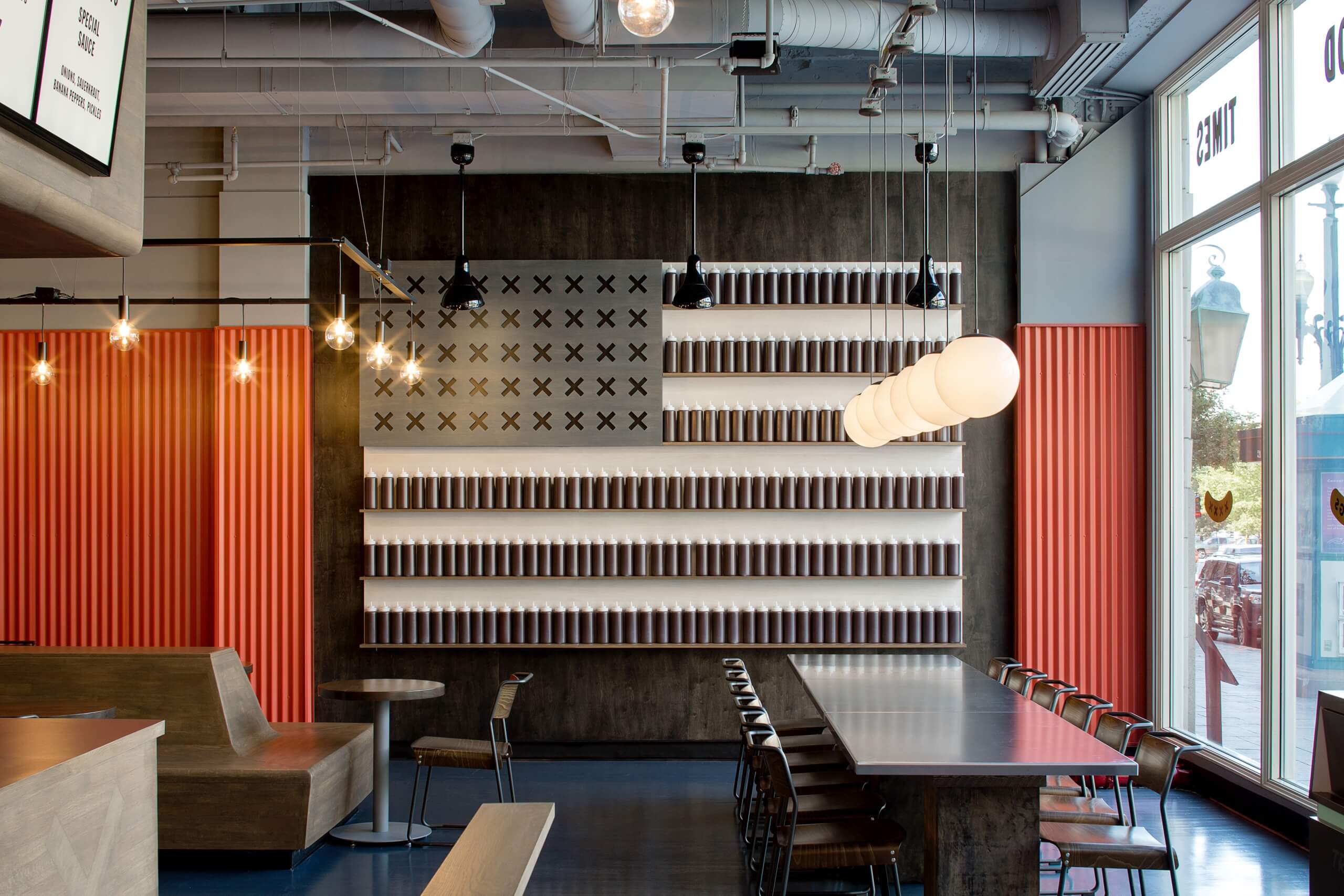
An American flag made out of Special Sauce is a tribute to the heartland, and a photo-ready installation that customers love. Colt Bowden’s mural of the hot dog in-hand during prayer is a slightly more tongue-in-cheek moment — a play both on the “religious experience” of eating at J. Dawgs and the religious city the restaurant calls home. We even commissioned a former employee slash illustrator to create a poster series of the secret menu, featuring the Five-0, the O.T. (Old Testament: a burnt offering), and the Right Side.


Hot digital dawg
The Website
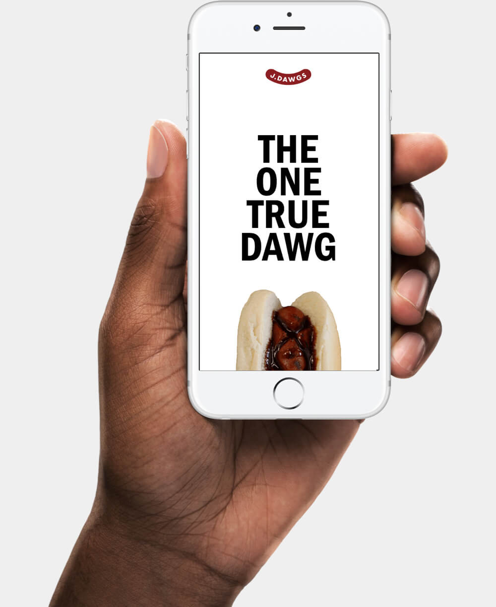
The J. Dawgs website is a riot of unexpected moments and genial wise-cracking. Instead of the three line “hamburger” that most websites use to hide drop down menus — shouldn’t J. Dawgs get a hot dog? We thought so too. Whether you’re finding the location nearest to you, reading about the origin story, or booking a catering van, constant surprises follow you down the page.
From the grill of Jayson Edwards
Business cards and collateral
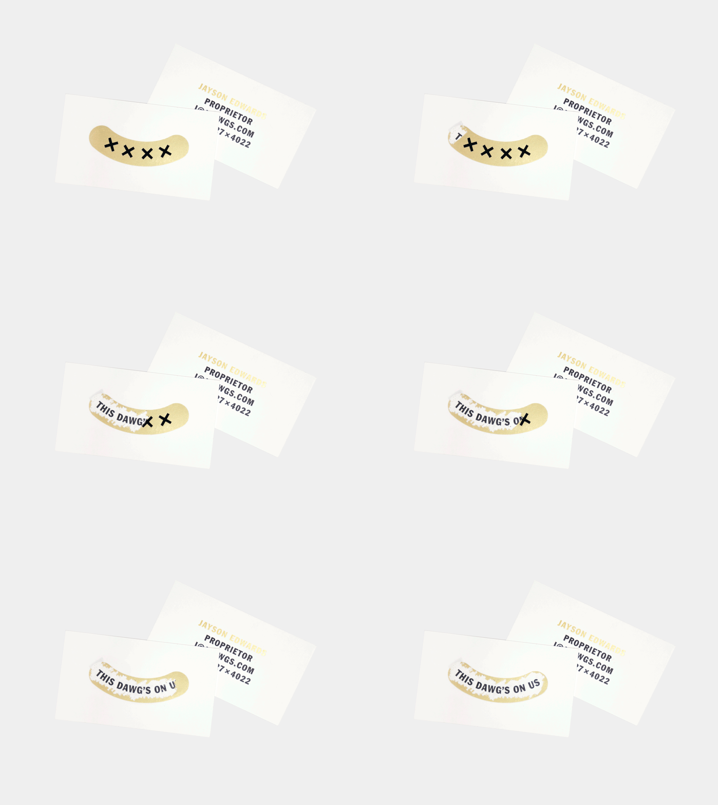
Jayson Edwards’ business cards don’t say “owner” or “CEO.” They say “Proprietor” and “Grill Master.” To transform the standard business card interaction into something fun, generous, and meaningful, we created scratch-offs that promise free hot dogs at next visit. So we meat again.


Before designing J. Dawg’s first downtown Salt Lake City restaurant, we needed to help them rediscover their own magic. Together we pinpointed what made it great at the beginning: the great dawgs and good times. Bonafide, convivial, and just plain fun, the refreshed J. Dawgs brand is as familiar as it is unique.
Dusting off a good story
Brand strategy
Every brand has a story‒and J. Dawgs has an especially powerful one. Imbued with the personality of its founder, J. Dawgs is equal parts scrappy underdog, lovable rebel, and trustworthy everyman. But these things were getting lost in translation in their new restaurant spaces, and core messages had been watered down.
After a few workshops,we aligned on joy as the reason J. Dawgs exists. The restaurants should create joy by serving real ingredients, providing awesome service, and creating a vibe as casual and fun as a ballpark in the summertime. That right there is the secret sauce.


All about the dawg
Brand identity
When we got to it, J. Dawgs logo was exactly what you’d expect of a fast casual chain. And there lay the rub. To create a more iconic mark, we made the hot dog king and added a bold, custom typeface. The secondary mark riffs on the patented x’s scored onto each dawg, turning an aesthetic trademark into a J. Dawgs signature.


Feast for the senses
A kitchen-centered restaurant
With the kitchen at its center, you can see the faces of the grill masters, hear and the beef sizzle, and see and smell the dawgs in all their glory. Sidle up to the dawg bar to skip the line, or take a seat at the old railway station-style banquette. Red corrugated steel gives a material nod to the original red shack, and painted plank floors add to the throwback feel.


Fresh threads
Grill Uniforms
Part of creating a fun, relaxed restaurant is making sure employees feel good. Grill-grade aprons, flat brim baseball caps, and a set of simple black t-shirts are part of a system that encourage employees mix-and-match, and customers to rep J. Dawgs out on the street.

Wash up
Basin sink
At first glance, the trough sink at the back of the restaurant is just a great way to get the sauce off your hands. But it also evokes familiar memories like washing up around dinnertime. For adults, the powdered soap may be a nostalgic reminder of their time in elementary school. For kids, it’s a memorable novelty and another deliciously tactile experience.

Americana with a twist
Playful moments
An American flag made out of Special Sauce is a tribute to the heartland, and a photo-ready installation that customers love. Colt Bowden’s mural of the hot dog in-hand during prayer is a slightly more tongue-in-cheek moment — a play both on the “religious experience” of eating at J. Dawgs and the religious city the restaurant calls home. We even commissioned a former employee slash illustrator to create a poster series of the secret menu, featuring the Five-0, the O.T. (Old Testament: a burnt offering), and the Right Side.


Hot digital dawg
The Website
The J. Dawgs website is a riot of unexpected moments and genial wise-cracking. Instead of the three line “hamburger” that most websites use to hide drop down menus — shouldn’t J. Dawgs get a hot dog? We thought so too. Whether you’re finding the location nearest to you, reading about the origin story, or booking a catering van, constant surprises follow you down the page.


From the grill of Jayson Edwards
Business cards and collateral
Jayson Edwards’ business cards don’t say “owner” or “CEO.” They say “Proprietor” and “Grill Master.” To transform the standard business card interaction into something fun, generous, and meaningful, we created scratch-offs that promise free hot dogs at next visit. So we meat again.
