The North Face Showroom
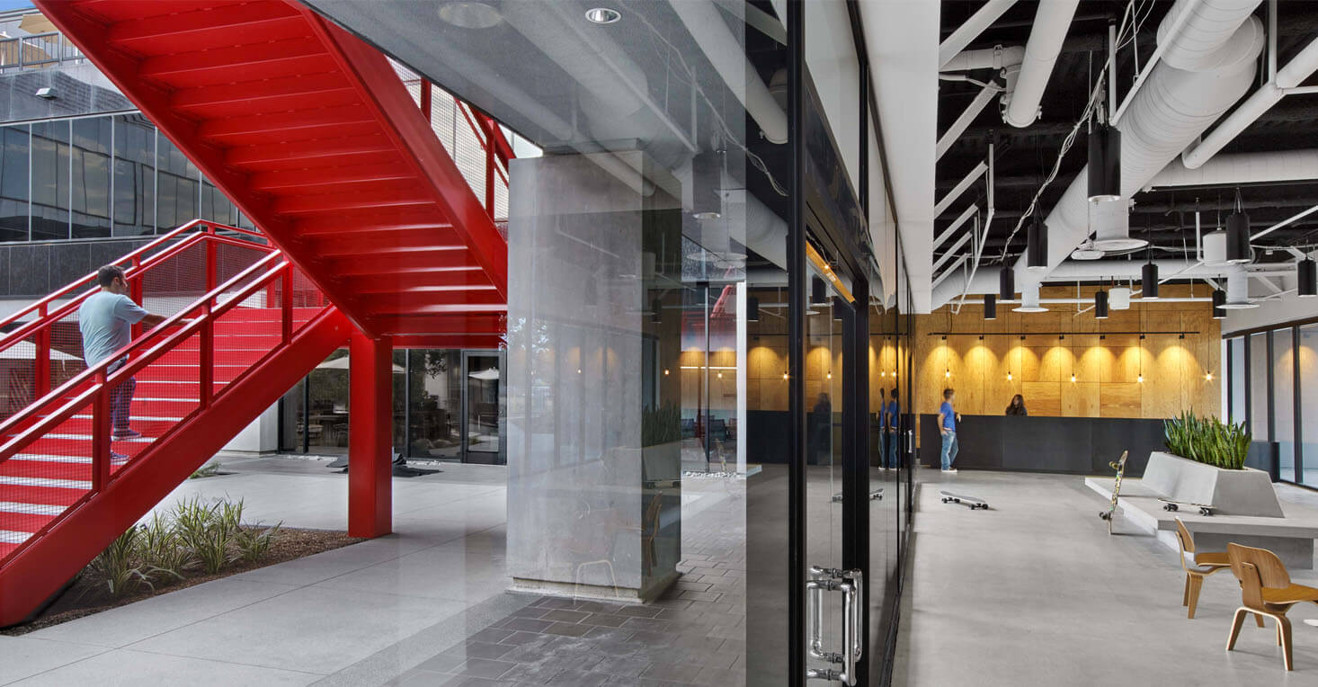
When The North Face began planning for a new showroom in Manhattan’s NoHo neighborhood, they saw the move as a chance to rethink how retail buyers would be introduced to their newest products.
Environment · Strategy
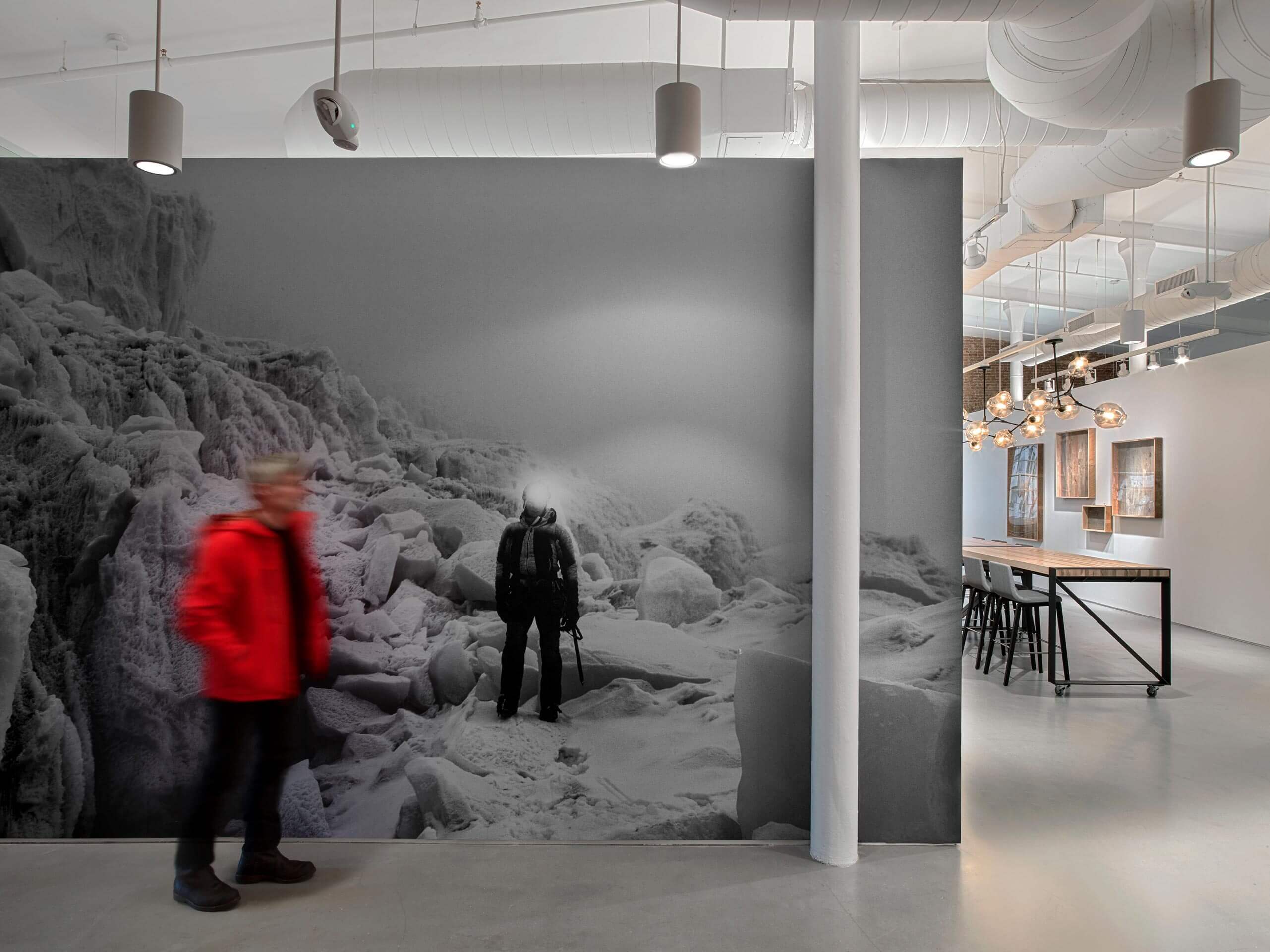
Working with long-time design partner Rapt Studio, the team imagined a space that would tell the story of The North Face—their “Never Stop Exploring” mantra inspiring design elements and graphics of the farthest-flung corners of the globe—while still allowing their performance apparel, equipment, and footwear to take center stage.

Situated on the eighth floor of the historic De Vinne Press Building, the space had seen over a century of uses, everything from print house to photography studio—in the 1980s it was even the set of a short film by Woody Allen.
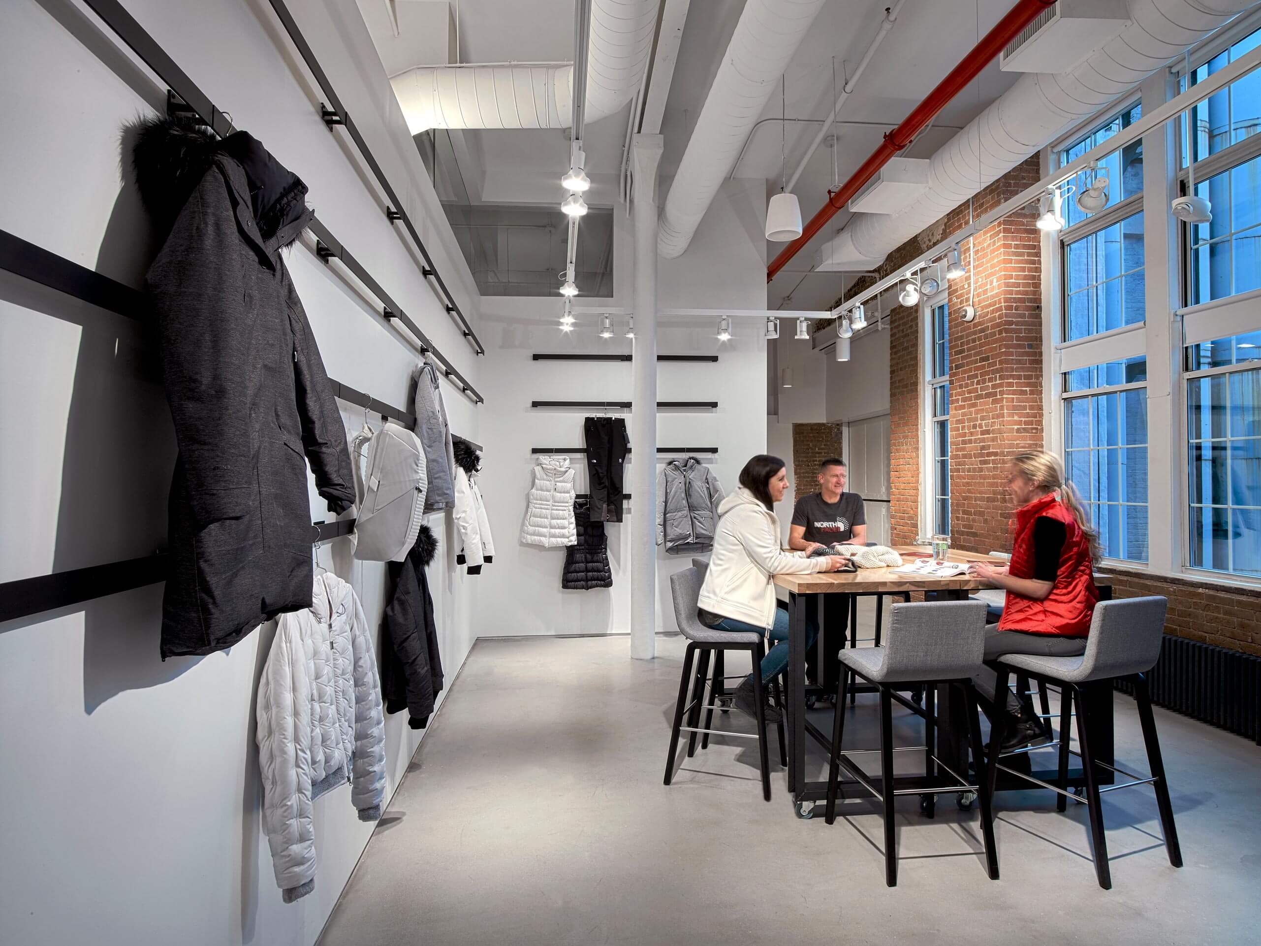
Decades of paint and other materials camouflaged the underlying character of the building, and the design team wanted to strip it all away. The restoration of brick walls, columns, and windows provides a simple yet sophisticated architectural backdrop. The material palette is restrained: local reclaimed wood, hickory timber, and blackened steel.
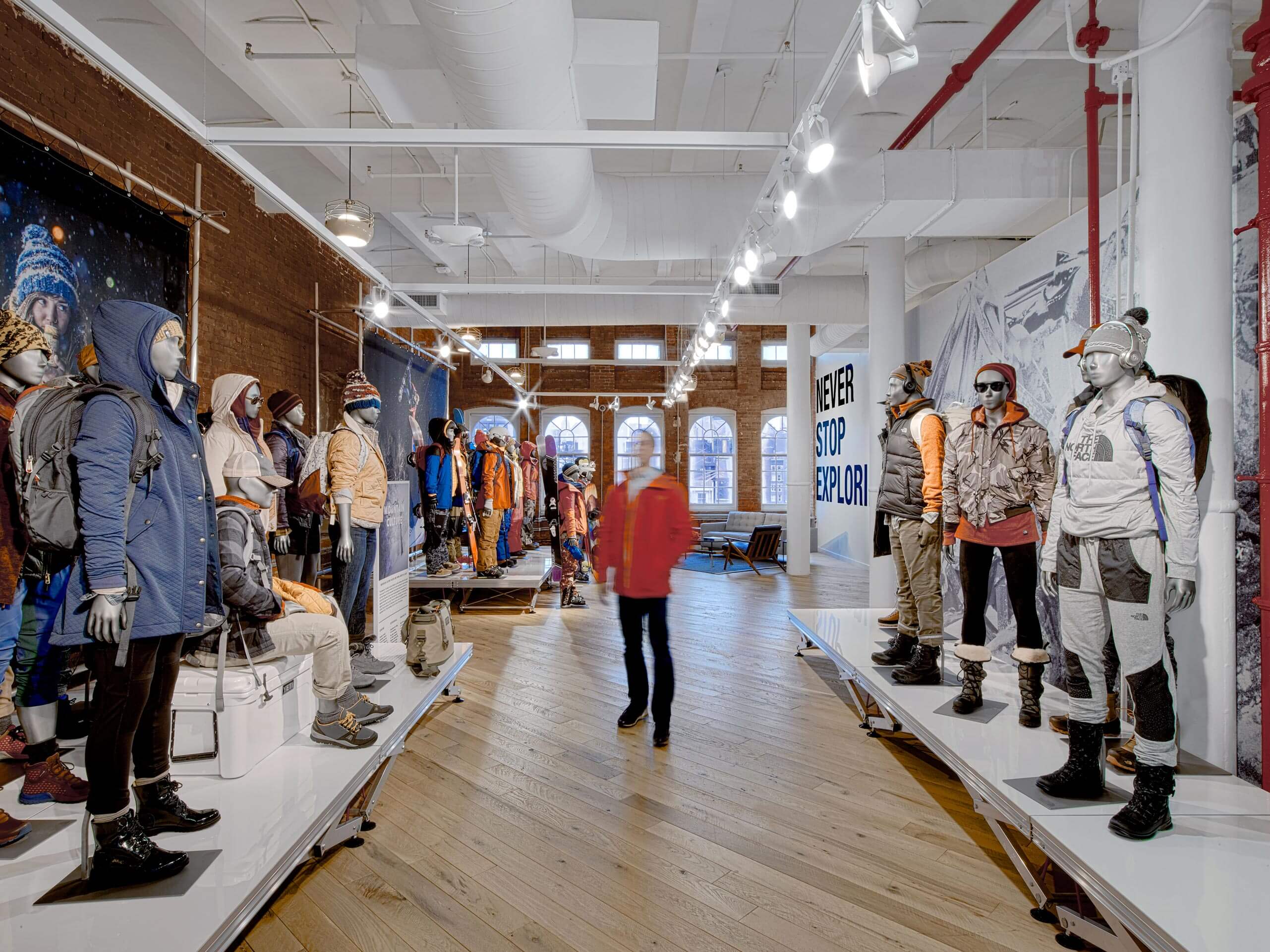
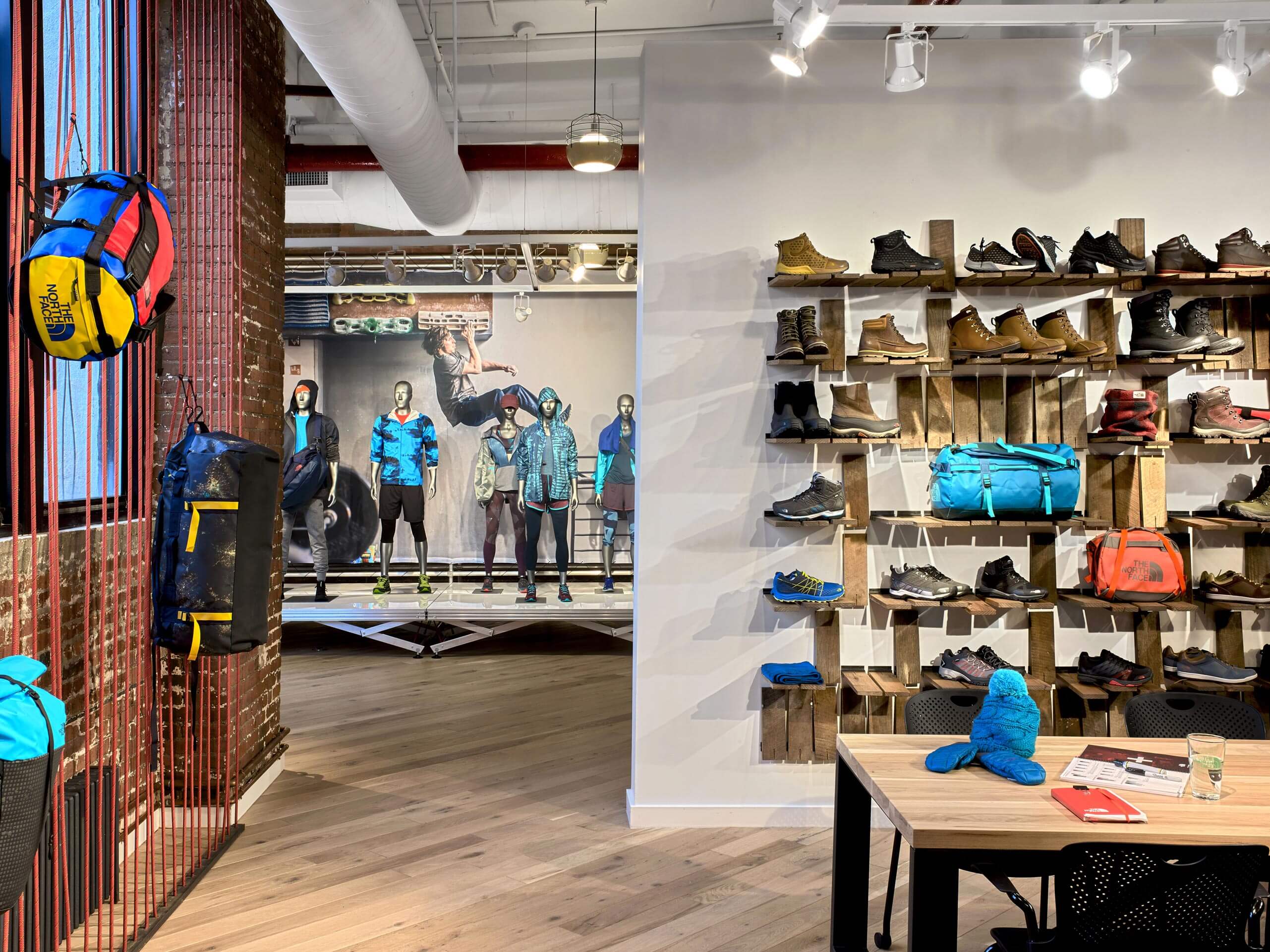


Old pieces of barn siding are reimagined and restored as flip-up shelves. The pendant fixtures are reminiscent of old gas lanterns used by explorers in their treks around the globe. Each design decision was made to complement—not compete with—The North Face products on display.
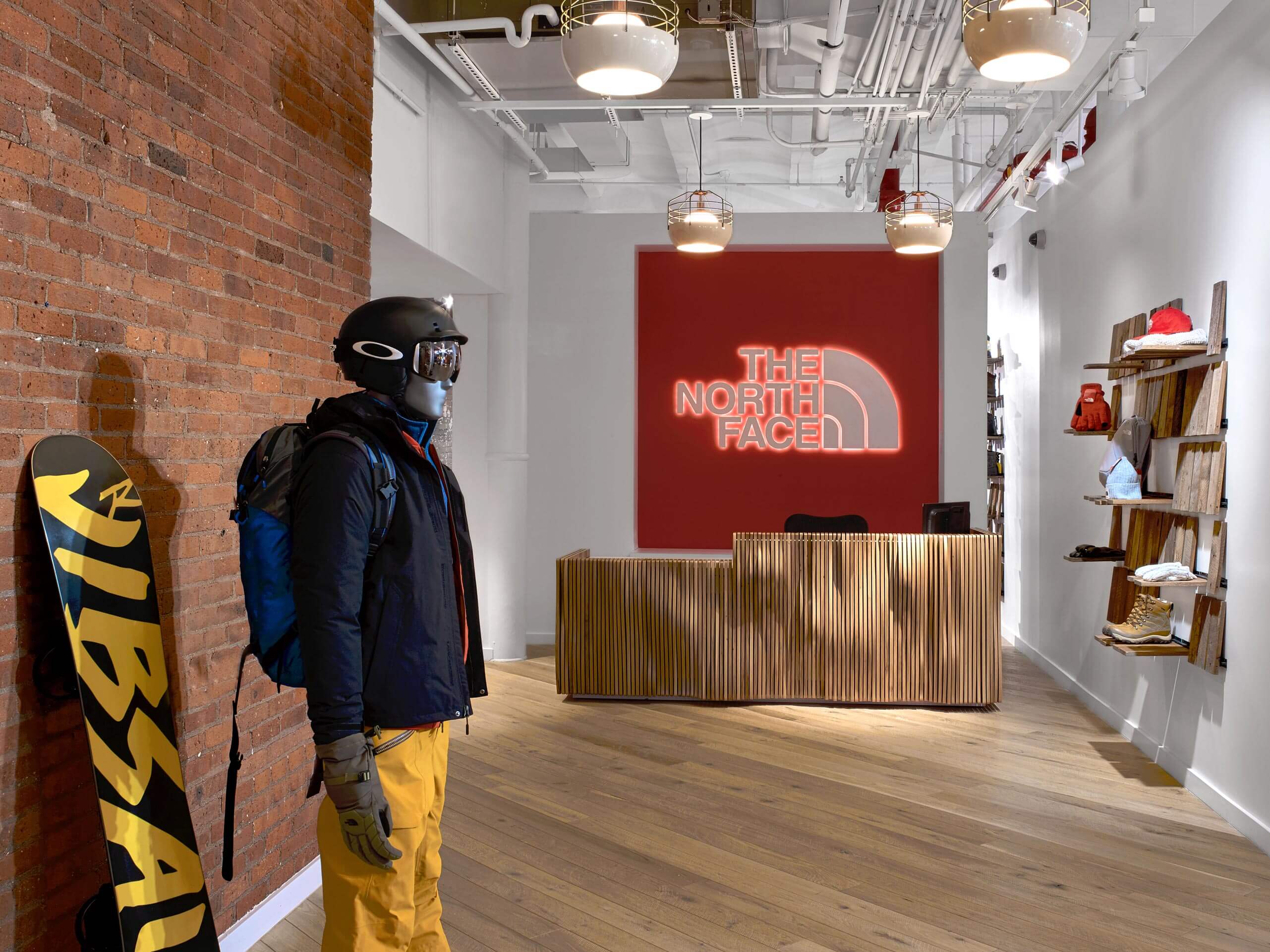
A back-lit, metal topographic installation of Yosemite’s Half Dome—also featured in The North Face logo—greets visitors at the entrance of the space. The reception area features equipment and apparel prominently on display, as well a custom reception desk made of wood layers. The walls throughout the space are free-standing planes that end a few feet short of the ceiling, allowing views from one area to the next and emphasizing the ceiling height.


Situated on the eighth floor of the historic De Vinne Press Building, the space had seen over a century of uses, everything from print house to photography studio—in the 1980s it was even the set of a short film by Woody Allen.
Decades of paint and other materials camouflaged the underlying character of the building, and the design team wanted to strip it all away. The restoration of brick walls, columns, and windows provides a simple yet sophisticated architectural backdrop. The material palette is restrained: local reclaimed wood, hickory timber, and blackened steel.


Old pieces of barn siding are reimagined and restored as flip-up shelves. The pendant fixtures are reminiscent of old gas lanterns used by explorers in their treks around the globe. Each design decision was made to complement—not compete with—The North Face products on display.
A back-lit, metal topographic installation of Yosemite’s Half Dome—also featured in The North Face logo—greets visitors at the entrance of the space. The reception area features equipment and apparel prominently on display, as well a custom reception desk made of wood layers. The walls throughout the space are free-standing planes that end a few feet short of the ceiling, allowing views from one area to the next and emphasizing the ceiling height.
